Thursday, 28 March 2013
Media Evaluation: Question 1
http://prezi.com/okkgsbpa1dqw/question-1/?kw=view-okkgsbpa1dqw&rc=ref-36014605
The link above is our response to the Evaluation- Question 1. It's for our A2 Media Question.
The question was: 'In what ways does your media product use, develop or challlenge forms and conventions of real media products?
The link above is our response to the Evaluation- Question 1. It's for our A2 Media Question.
The question was: 'In what ways does your media product use, develop or challlenge forms and conventions of real media products?
Media Evaluation: Question 2
http://prezi.com/uctjuxl97dpm/untitled-prezi/?kw=view-uctjuxl97dpm&rc=ref-36014605
The link above is our evaluation question 2 for Media Coursework (A2).
The question was 'How effective is the combination of your main product and ancillary texts?
The link above is our evaluation question 2 for Media Coursework (A2).
The question was 'How effective is the combination of your main product and ancillary texts?
Evaluation: Question 3
http://prezi.com/4u9gao5g7bjd/untitled-prezi/?kw=view-4u9gao5g7bjd&rc=ref-36014605
The link above is the Prezi powerpoint we created in order to answer question 3 of our Media A2 Coursework.
The question was: 'What have you learned from your audience feedback?'
The link above is the Prezi powerpoint we created in order to answer question 3 of our Media A2 Coursework.
The question was: 'What have you learned from your audience feedback?'
Wednesday, 27 March 2013
Evaluation: Question 4
How did you use new media technologies in the construction and research, planning and evaluation stages?
Technology played a key part in the development and construction of our planning, research and evaluation stages. All the websites we used on the Internet offered different skills, and were used at different stages of the project, some in the creation of the poster, website and trailer, others in offering information in our research.

We used You Tube to help gain an insight into other social realist films. You Tube offered showings of other social realist trailers such as 'Shifty' and 'Trainspotting' which are two famous social realist films. This helped us to learn more about how to construct and develop a social realist trailer. After viewing these, we could then identify certain social realist conventions that appear in the successful films and adapt them to our trailer in our own unique way and were relevant. These were areas such as the brick wall covered in Graffiti (which we used for our poster image) and the block of run-down flats (which we used for the website and in our trailer). We also used You tube to help upload our film, and transfer it over to the website, and although the downloading process was prolonged, it worked well and we were happy with the transfer.

In our project, Google was effectively the hub of the information. We used Google to search for all our programs, these included Pixlr, Scribus, Dafont, Blogger, OCR and many more. Google opened up so many options for us in the making of this project and give us access to many useful sites that contributed to the final product in the website, trailer and poster.

Pixlr is a photo editing program that allowed us to edit photo's we had taken in a poster format. This was a vital program in relation to the making of the poster as it allowed us to upload the photo in poster format, in original and in-depth focus quality. We found it easy to use, and very useful in the development of the poster. This combined with Scribus was the two programs we used to make the poster. Pixlr is an Open Source Software which allowed us to carry out complex manipulations to the important assets of our poster, the image and layout.

Wix was a website that helped you design your own website. This give you the basic template and guidelines of building a website, and it was down to you add the content of your choice. We used the template to help set up our website, and moving the text and uploading the image was our initial move, and developed the rest around this basic start. On this website, we was able to use the tabs at the top to create drop down boxes that acted as headings, this allowed us to give it a basic and simple layout, easily used. These added to the construction of this particular ancillary task. We then used Wix for a different reason, which linked with our research. Using this program, as a website creator- allowed us to gain audience feedback as we asked 10 people to view our trailer from the website, and feedback. These ages varied from 15- 20 which fitted into the target audience bracket, and one older member of the public who wasn't apart of the target audience bracket, just to vary the feedback and gain an insight into an older interpretation of the film.

Scribus was a desktop publishing program installed into the school PCs which allowed us to edit a photo (add text and effects). So we uploaded the photo we had created from Pixlr on to Scribus where we could add text through creating layers, as explained in the blog. This was useful due to the fact it helped finalise the poster with text on top, this text was the title, billings, ratings, certificate and release date. This was done through layers, that were added on top of each other, as demonstrated in the blog; which then meant there was no image collapse or overlay on the poster. This combined with the image was the making of the poster, and a prime example of how we used two areas of technology together, utilising each to there capability to form the poster, our other ancillary product. With Scribus also being an Open Source Software, it allowed us to carry out text manipulations on the poster, that at times were complex in regards to positioning and size.

To edit our trailer, we used a program called Sony Movie Studio Platinum. This allowed us to edit the trailer, and add effects and graphical shots. This was the stage where we pieced together our movie, finalising the shots we wished to add to form our movie. This was very helpful, complicated at times but useful in the end. This is also where, we uploaded the Tascam sound and edited it in sync with the movie and soundtrack, overall leading to the final main product, our trailer for a film called 'Subsidence'. The complication with this program was in areas of the editing, in terms of uploading the footage, as the files at first didn't want to copy into the box where we could drag the clips around and order them. In terms of our preparation to editing, this helped us a lot. We initially planned to upload the footage onto the program, and start to assemble the footage, and bin what was useless, or an out-take. Then we started to order the shots and clips, adding graphical shots and using sound affects of the Internet (not copied)- and by this stage, the trailer was starting to come together, will slight adjustments needing to be made to the Tascam sound which was out of time, but soon adjusted back in sync. This program allowed us to all of this in time, and was efficient and a success.

We used the OCR website to help understand where we can pick up marks in the coursework, and to help give us some guideline in to what we need to get a good grade. It was useful, and we followed advice and used previous examples they offered in order to get the better marks. This was the website that helped structured our three projects, and we closely analysed the grade boundaries and previous examples in order to combine our feedback from them and apply it to our three media products.

Dafont was a website that offers a variety of fonts for you to take away and add to your design, for us we needed one to use for the poster, and the general one for our overall text for 'Subsidence'. We chose one called 'Brain Flower' which was under the handwritten section of the website, and we chose this simply because it give a realistic effect and linked to idea of social realism.

In terms of the filming itself, we used the Canon 55OD camera (similar to the above model). It offered good light settings and good effects that helped make the poster picture. It filmed well, with good battery use and a simple and effective layout. This allowed us to film at different shutter speeds and adjust the settings to suit what we wanted in our film, which was a general 'low light' scheme in order to reflect the realism the characters face, in their brutal working class lives and the impact the drugs has on them. The camera, due to it's technical ability, allowed us to carry out manual functions such as the focus, zoom and exposure. These contributed to the film in different ways, zoom helping to show a close up on an object- expression of emotions, the exposure helped us set an atmospheric scene in which the characters could be feeling low so the light in the scene was low and negative. In terms of the focus, this camera was excellent, with a very tight focus that allowed us to blur background and give good, effective character focus.

Blogger was used for the blogging part of the coursework. We used blogger to upload our process of making the three products, by putting it in to text format. We have blogged over 30 different times, all relevant to one of our products, if not all three. This has helped us to understand the development we have made from the beginning when we made the first blog. It has also helped us in the evaluation stages of the coursework, as it offers a large space for text to be filled with images. This helped us to complete questions of the evaluation and be able to share our process by making the blog open to anyone who comes across it. It also helped in the planning stages, somewhere we could upload the questionnaires and other sources of research, comparing and contrasting between primary and secondary.

Prezi is a unique way to process information, through clever PowerPoint's that are easy on the eye. We used this to be creative in our evaluation stages, by using the templates offered we added the information in questions 1, 2 and 3 of our coursework evaluation. This helped us to note our process following the questions set, and was vital in relation to us explaining 'step by step' how we made our three products, and all the research into them that went on.
Overall, it was the combination of these media technologies that formed our three media products, all contributing to different areas of the task. Due to these technologies mentioned, our products were much easier to make and were a more successful end product. This was because of the information they offered, through examples and text we could base areas of our project on templates and previous identical tasks that were on offer for us to view. Each individual piece of new media technology we used had it's own independent quality, and some combined to form our media products.
Technology played a key part in the development and construction of our planning, research and evaluation stages. All the websites we used on the Internet offered different skills, and were used at different stages of the project, some in the creation of the poster, website and trailer, others in offering information in our research.
We used You Tube to help gain an insight into other social realist films. You Tube offered showings of other social realist trailers such as 'Shifty' and 'Trainspotting' which are two famous social realist films. This helped us to learn more about how to construct and develop a social realist trailer. After viewing these, we could then identify certain social realist conventions that appear in the successful films and adapt them to our trailer in our own unique way and were relevant. These were areas such as the brick wall covered in Graffiti (which we used for our poster image) and the block of run-down flats (which we used for the website and in our trailer). We also used You tube to help upload our film, and transfer it over to the website, and although the downloading process was prolonged, it worked well and we were happy with the transfer.
In our project, Google was effectively the hub of the information. We used Google to search for all our programs, these included Pixlr, Scribus, Dafont, Blogger, OCR and many more. Google opened up so many options for us in the making of this project and give us access to many useful sites that contributed to the final product in the website, trailer and poster.
Pixlr is a photo editing program that allowed us to edit photo's we had taken in a poster format. This was a vital program in relation to the making of the poster as it allowed us to upload the photo in poster format, in original and in-depth focus quality. We found it easy to use, and very useful in the development of the poster. This combined with Scribus was the two programs we used to make the poster. Pixlr is an Open Source Software which allowed us to carry out complex manipulations to the important assets of our poster, the image and layout.
Wix was a website that helped you design your own website. This give you the basic template and guidelines of building a website, and it was down to you add the content of your choice. We used the template to help set up our website, and moving the text and uploading the image was our initial move, and developed the rest around this basic start. On this website, we was able to use the tabs at the top to create drop down boxes that acted as headings, this allowed us to give it a basic and simple layout, easily used. These added to the construction of this particular ancillary task. We then used Wix for a different reason, which linked with our research. Using this program, as a website creator- allowed us to gain audience feedback as we asked 10 people to view our trailer from the website, and feedback. These ages varied from 15- 20 which fitted into the target audience bracket, and one older member of the public who wasn't apart of the target audience bracket, just to vary the feedback and gain an insight into an older interpretation of the film.
Scribus was a desktop publishing program installed into the school PCs which allowed us to edit a photo (add text and effects). So we uploaded the photo we had created from Pixlr on to Scribus where we could add text through creating layers, as explained in the blog. This was useful due to the fact it helped finalise the poster with text on top, this text was the title, billings, ratings, certificate and release date. This was done through layers, that were added on top of each other, as demonstrated in the blog; which then meant there was no image collapse or overlay on the poster. This combined with the image was the making of the poster, and a prime example of how we used two areas of technology together, utilising each to there capability to form the poster, our other ancillary product. With Scribus also being an Open Source Software, it allowed us to carry out text manipulations on the poster, that at times were complex in regards to positioning and size.
To edit our trailer, we used a program called Sony Movie Studio Platinum. This allowed us to edit the trailer, and add effects and graphical shots. This was the stage where we pieced together our movie, finalising the shots we wished to add to form our movie. This was very helpful, complicated at times but useful in the end. This is also where, we uploaded the Tascam sound and edited it in sync with the movie and soundtrack, overall leading to the final main product, our trailer for a film called 'Subsidence'. The complication with this program was in areas of the editing, in terms of uploading the footage, as the files at first didn't want to copy into the box where we could drag the clips around and order them. In terms of our preparation to editing, this helped us a lot. We initially planned to upload the footage onto the program, and start to assemble the footage, and bin what was useless, or an out-take. Then we started to order the shots and clips, adding graphical shots and using sound affects of the Internet (not copied)- and by this stage, the trailer was starting to come together, will slight adjustments needing to be made to the Tascam sound which was out of time, but soon adjusted back in sync. This program allowed us to all of this in time, and was efficient and a success.
We used the OCR website to help understand where we can pick up marks in the coursework, and to help give us some guideline in to what we need to get a good grade. It was useful, and we followed advice and used previous examples they offered in order to get the better marks. This was the website that helped structured our three projects, and we closely analysed the grade boundaries and previous examples in order to combine our feedback from them and apply it to our three media products.
Dafont was a website that offers a variety of fonts for you to take away and add to your design, for us we needed one to use for the poster, and the general one for our overall text for 'Subsidence'. We chose one called 'Brain Flower' which was under the handwritten section of the website, and we chose this simply because it give a realistic effect and linked to idea of social realism.
In terms of the filming itself, we used the Canon 55OD camera (similar to the above model). It offered good light settings and good effects that helped make the poster picture. It filmed well, with good battery use and a simple and effective layout. This allowed us to film at different shutter speeds and adjust the settings to suit what we wanted in our film, which was a general 'low light' scheme in order to reflect the realism the characters face, in their brutal working class lives and the impact the drugs has on them. The camera, due to it's technical ability, allowed us to carry out manual functions such as the focus, zoom and exposure. These contributed to the film in different ways, zoom helping to show a close up on an object- expression of emotions, the exposure helped us set an atmospheric scene in which the characters could be feeling low so the light in the scene was low and negative. In terms of the focus, this camera was excellent, with a very tight focus that allowed us to blur background and give good, effective character focus.
Blogger was used for the blogging part of the coursework. We used blogger to upload our process of making the three products, by putting it in to text format. We have blogged over 30 different times, all relevant to one of our products, if not all three. This has helped us to understand the development we have made from the beginning when we made the first blog. It has also helped us in the evaluation stages of the coursework, as it offers a large space for text to be filled with images. This helped us to complete questions of the evaluation and be able to share our process by making the blog open to anyone who comes across it. It also helped in the planning stages, somewhere we could upload the questionnaires and other sources of research, comparing and contrasting between primary and secondary.
Prezi is a unique way to process information, through clever PowerPoint's that are easy on the eye. We used this to be creative in our evaluation stages, by using the templates offered we added the information in questions 1, 2 and 3 of our coursework evaluation. This helped us to note our process following the questions set, and was vital in relation to us explaining 'step by step' how we made our three products, and all the research into them that went on.
Overall, it was the combination of these media technologies that formed our three media products, all contributing to different areas of the task. Due to these technologies mentioned, our products were much easier to make and were a more successful end product. This was because of the information they offered, through examples and text we could base areas of our project on templates and previous identical tasks that were on offer for us to view. Each individual piece of new media technology we used had it's own independent quality, and some combined to form our media products.
Graphics
The graphics we used in this trailer add a deliberate effect of introducing the director and responses to the film; this all helps to not only promote the film, but help break the film up from just a 'solid block' of video.
We promoted the film in the trailer buy adding the reviews and rating of two worldwide names in the media industry to try and persuade the viewer to follow the bigger names into liking the film and taking further interest in it, and watching the full film. This shows we have considered the promotion aspect to the project.
As for the graphics breaking the film up, it simply helps the film flow, and the cut and fades into and out of the graphics help it to gain pace and drama. This is good on the naked eye and very appealing along with helping the story flow. The overall effect then removes the solid block of video and also explains the producers and actors involved which is also key in promoting films- as we found in research into other social realist films and trailers.
As for the colour scheme, we kept it black and white deliberately to break up the film from the dominant colours of the film (environmental colours). Also, it stood out and give the effect of emphasising the text. The colours helped it easier to read and also, due to the fact they had to be short to keep the flow of the film moving pacey. This leads on to the final point on the graphics, the way we ensured the text on the graphics was short and easy to read as it was vital for the audience to read this quickly and understand, along with keeping the quick atmosphere the movie has and needed.
Editing
When filming, we used a tascam to record the sound separately from the camera. This meant that the sound could be picked up from shorter distances and in a much better quality. When editing, we had to sync-sound, which means that we had to match the sound to the video. The clapperboard is an essential aspect of this because it meant I could match the sound of the clap, to the shutting of the board within the video.
After sync-sounding, we had to cut down the shots so that they included the vital action that we needed for our trailer. For the scenes which involved more than one shot, we had to juxtapose the shots so that they created a smooth, continuing action. This is where continuity editing comes in. Matching-on-action is a technique which allows the continuity of shots to be as effective as possible. It allows the scene to flow smoothly looking realistic. This again, is a huge convention of Social Realist films due to the natural and realistic representations which are created.
After the micro-editing, we had to focus on the 'macro-editing'. This is the putting together of scenes (instead of shots - micro). To do this we used the shot list and original storyboards as a guide and placed the appropriate scenes next to one another. However, during this process changes were made, and scenes were manipulated. This is because once we placed certain scenes together, we felt that as a trailer, it would be much more effective with more mystery. The worry was, that we were giving too much information away to the audience and in order to create suspense and influence the audience to watch the film, we needed much more of a cliff-hanger. Some shots were found to be slightly irrelevant to trying to present the basis of the film (without giving too much information away).
The transitions between the shots are added once all the scenes have been composed together. We felt that the more simple the transitions were, the more effective. We didn't want the film to be considered to be 'cheesy' and after watching other social realist film trailers, we recognised the simplicity used. We simply used a 'Fade through black' for most of our shot, with the exception of the last graphics shot. For this we used a 'Paint Splatter' effect which corresponds with the concept of graffiti.
Sound Track
A soundtrack is very important to any trailer, and in relation to social realism, vital. We chose our soundtrack off a website which allows you to download free music and soundtracks called www.last.fm which was very helpful, and non-copyright.
We felt the particular soundtrack we chosen fitted our film perfectly, as it talks about crystal maze which is similar in sound to crystal meth which is a drug, and subsidence is all about drugs. The soundtrack had a fast tempo and this helped our film have a good flow and fast pace at times of need.
We managed to edit it in sync with the trailer, and further edited it to reflect the atmosphere of the scene it was over lapping. This was hard work, but works well with the trailer and overall it helps to reflect the atmosphere. This is vital to social realist trailers as we (as a maker) have to make sure we address the audience with this atmosphere to help them get involved in the trailer. This is why the soundtrack worked well.
The soundtrack we used was called- Crystal Vases by The Last Royals. In our research into other social realist films, we gained the interpretation that they too had this idea of using the soundtrack to help create the pace of the trailer- which is why we chose to follow this.
Filming
We used a similar approach to Mike Leigh in terms of scripting. We felt that in order to recieve the most natural and realistic performances, we should let or actors freely improvise with the guidelines of the scene. This meant that the performances that are presented, come from the actors natural reactions and responses to the situation.
We filmed on location for all our scenes (similarly to Mike Leigh again) due to the fact the settings and mise-en-scene is natural and realistic which emphasises the 'Social-Realism' aspect. This allows the audience to relate to and to understand the surroundings and nature of the film as a whole.
Aswell as using specific locations, we also manipulated the settings so that it directly corresponds with our film specifically. For example, in one scene, we see a note being written. In the background, we placed a drug 'Baggy' and a credit card so that the setting still matched the narrative. This instantly lets the audience know the type of character that is being presented in a subtle, but effective way.
We also used the natural light to our advantage throughout filming, however at some point we needed a little added light to highlight certain aspects of the film. To do this we used a torch light from outside the shot so that the detail can be seen easily by the audience.
Reseacrh and Planning: Shot List
Shot 1- Graphics saying “LP Productions”
Shot 2- Establishing Shot- block of flats
Shot 3- Wide Shot with Lizzie sitting at a bus stop texting
Shot 4- Over the shoulder shot of Lizzie texting Ty
Shot 5- Graphics “From the directors Loomer and Parker”
Shot 6- Wide Shot of Ty acting strangely against some
garages
Shot 7- Close up of Lizzie talking to Ty on a bench
Shot 8- Close up of Dom responding to Lizzie
Shot 9- Close up of Lizzie responding to Dom
Shot 10- Close up of Dom and his facial emotion
Shot 11- Graphics “Award winning performances from Gavin and
Stirling”
Shot 12- Mid shot (close) of Ralph knocking on a door (outside)
Shot 13- Mid shot (close) of Ty answering the door (inside)
Shot 14- Mid shot (from outside) (close) of Ty answering to
Ralph
Shot 15- Mid shot of Ty slamming the door (inside) and Ralph
knocking on the door in response
Shot 16- Mid Shot of Lizzie and Ty arguing in the kitchen
over drugs
Shot 17- Graphics “A classic and faultless portrayal of
Urban Britain- Daily Mail (4 star)
Shot 18- Close up of Lizzie talking on the phone
Shot 19- Close up of Lizzie talking on the phone (closer)
Shot 20- Mid Shot of Lizzie still talking on the phone
(further away)
Shot 21- Close up of Lizzie on the phone talking
Shot 22- Graphics “It’s a must see”- Sight and sound (4
star)
Shot 23- Close up of Ralph writing a note addressed to Ty.
Shot 24- Low angle shot of Ty walking into a graveyard.
Shot 25- Graphics of the title and release date (with
effect)
Reseacrh and Planning: Scripts for the film
Bench Scene
(Lizzie and Ty sitting on a bench in a public park)
Lizzie: (Looking confused) Whats going on?
Ty: (Pauses, long hesitation) Nothin'
Lizzie: (Looking curious) Look at me
Door Scene
(Raplh walks up to door, we see his reflectin but not his face!)
(Ralph knocks aggressively on the door, Ty answers)
Ralph: Alright Tyrone (Deep, mysterious voice)
(Ty slams door and Ralph bangs louder on the door to get his attention)
Kitchen Scene
(Lizzie and Ty are in Lizzie's kitchen arguing about Ty's addiction)
Lizzie: (Extremely angry) I just don't understand! Why would you do this to yourself?!
Ty: Do what?
Lizzie: Im asking you a question! What do you think? What is wrong with you! (Lizzies voice gets louder and louder)
Ty: Its only drugs!
Lizzie: Only drugs!?
(Ty pushes Lizzie out of anger and exits shot)
Phone Voicemail Scene
(Lizzie is in a shed-like hut, frantically worrying about her boyfriend. She is leaving voicemails on his phone)
Lizzie: I just don't actually know where you are and I'm a bit worried -
Lizzie: Call me back as soon as you can -
Lizzie: I just don't really know what to do, I don't know where you are are you okay?-
Lizzie: (Dissapointed) Okay.. bye.


Reseacrh and Planning: Analysis of the adoption agency scene from 'Secrets and Lies' - Mike Leigh
Adoption Agency Scene- Scene from ‘Secret and Lies’:
Camera: The use of the mid shot reverse allows us to gain our own interpretation of the characters persona created in the scene. In this case, the woman from the adoption agency is very comfortable in her surroundings, yet we also get the impression she may be over-comfortable for the other woman’s liking; we understand this through her body language in the scene. She is very uncomfortable, slightly awkward which could suggest she is out of her comfort zone. The use of the close up is also evident in this scene to show the difference in emotions of the woman. As it’s her job, the adoption agency woman is just doing her job, showing sympathy towards the woman who is trying to find her birth mother- this woman is obviously emotional and nervous as it’s something personal to her which is emphasised in this scene to create sympathy for her. Also represents the fact the conversation is getting more intense between Hortense and the adoption agency woman. The extreme close up is also used in the scene to help the audience understand Hortense’s current emotions (portrayed through tears) which again; creates the idea of sympathy.
Mise En Scene: Body language is very different between the pair; as the adoption lady has very manly, comfortable body language maybe portraying a masculine persona. She also seems to be incomplacent and messy- effectively too laid back for her job. However, Hortense is very lady like in terms of general image and body posture. She also is very nervous, emotional and uncomfortable. This is there to create sympathy for the character, in this case Hortense. The scene is associated with adoption, a nervy subject that is affecting many of today’s audience- which in terms of film is all about addressing the meaning of the scene.
Sound: The class system is portrayed through sound in this scene. The adoption lady speaks with a very abrupt tone, maybe even improvised. This could represent her working class origin. This again links to her ways of being unorganised. Hortense however, is very composed and speaks in a more respectable and well-mannered tone. This is done to show the difference between the two class origins- in doing this tackles the issue of class stereotypes.
Editing: The camera orders the shots to show the lack of organisation the lady from the adoption agency has, it also could be seen to question her professionalism and it’s also clear that at first, she doesn’t seem to impress Hortense. The style of editing is continuity editing in this; which is used to emphasise the element of reality in this scene and how it’s a general day-to-day issue faced in the current society. Overall, the editing could be used to show the working classes lack of social skills/organisation skills when dealing with another class.
Narrative: There is a barrier between each persona in this scene which is even more evident when identifying the narrative. It’s clear the two women come from different backgrounds and it could be argued that they have grown up to follow different life skills and social decisions. Hortense in this scene seems to be more lady like than the other, speaks in a serious manner with in-depth emotion and passion towards the situation; as it’s clearly personal. However, the difference in personality is also clear as the adoption agency woman speaks with an abrupt, rushed tone which could be argued to have a sarcastic tone? She could however just give the impression of being extra sensitive.
Reseacrh and Planning: Case Study - Shifty
Institutional Case Study- A2 Media Studies
‘Shifty’ (2008) – Eran Creevey
Basic Facts:
Running Time: 86 minutes
HE Certificate: 15
DVD Release Date: January 1st, 2009
DVD Initial Price (RRP): £4.44
Blu Ray Price: £8.91
‘Shifty’ was directed and written by Eran Creevey in 2008 and released under the genre of Thriller, however evidently a thriller created inside a social realist theme. It’s a film about a young crack dealer in South London , and his attempt to deal with the situations he faces day-to-day in his job. Chased by an addicted customer, and slowly being rejected by his family this film really does emphasise the true brutality and reality faced by a drug dealer who has become unorganised and set up through rivalry and jealousy. This is the exact intention of those who direct and produce films evolving around the idea of realism in society, in this specific case it shows the negativity drugs brings to not only and individual, but a society as well as testing the line of friendship between humans.
The
production company in this film was Between the Eyes who has also worked on
other films, and was the reason one of the main actor Riz Ahmed wanted the
role, as he had previous encounters with this production company as it helped
him in the music industry earlier on in his career. The box office results:
244, 579. This film was very low budget, as it simply doesn’t need much
addition as it’s all filmed on location to reflect realism. It took a whole 14
days to shoot this film, as its all based around 1 estate in London. This was
due to a scheme that tests directors to film low budget films, called the
‘Microwave Scheme’ and stay within this budget, something Evan Creevy opted to
challenge. Also, BBC worked closely with this film, with the full intent to
help promote the micro-budget film, as they are a large and powerful dominance
in British Television therefore could use adverts to help get the film across
the British public, for low cost, over all helping the promotion of the film.
Metronome was the main distribution company for this film, as research shows that the bigger distribution companies labelled ‘Shifty’ as a film that was too small for their idea. In an interview, Evan said that he personally thought the representatives from Metronome have the greatest creative flair and seem to show the most passion in ideas.

And the
choice of main colours (black, yellow) worked well together and made the poster
stand out, gain more appeal and was therefore easier on the public eye, later
described by a critic to have used “intelligent, bold colours”. Laid out with
the two main characters on the front, one critic claimed it to “set the film up
lovely, with the identification of the characters we come to follow and we seem
to become attached to as the film progresses”. The reviews give the poster 4.
The digital strategies used by Metronome was the creation of the website, which allowed users to send a fake email to friends which allowed them to trick them into thinking they were going to arrested for drug use (“Criminal Investigation”), this was an attraction to young people as they all felt the need to be a part of this prank. Facebook and Myspace both had pages created helping promote the film as well as interviews with the characters were being released over the Internet for fans use, and for the general public to stumble across whilst browsing, these techniques proved vital in the promotion of the film ‘Shifty’.
Reseacrh and Planning: Age Certificate and Target Audience
'Subsidence' has an age certificate of '15'. The reason we labelled this film a '15' was due to the content of the film not being particularly gory, or explicit but the major theme being drugs which means it can only be referred to by older teenagers that this age bracket applies to. Also, the film is very mature and the film certificate needed to relate to a teenagers life, specifically the maturer age of teenage years, hence the '15' certificate. There is also death in the film, and can therefore be categorised into the 15 age bracket- due to the sheer brutality and and cruelty of the death (although not really seen or emphasised in the trailer). According to the BBFC, 15 certificated movies can include violence, and no limit on bad words or actions. They cannot promote drug misuse, which is opposite to our intention, which was the deciding factor in grading the film a certificate. Our negative promotion of drugs complies with the certificate needs awarded buy the BBFC.
In terms of defining the target audience, we used a technique that is shortened to G.R.A.S.S.
This stands for Genre/ Race/Age/ Socio-Economic Status.
Genre- Subsidence can apply to both male and female. This is due to the story following two characters, both a boy and girl. Therefore a male can enjoy the physical side to the film and the females can enjoy the love related story to the film.
Race- Subsidence is a film opened to all races, from different ethnic minorities as they can still relate their lives to those in the film, and gain an insight into social realism as a whole.
Age- Focusing on areas of the film, we decided that the age range of 15- 25 was an age range that would be most likely to watch this film, due to the fact 15 year olds can compare the film to their current life and compare events, and the older age of the bracket can refer to how life used to be in their childhood or teenage years.
Socio-Economic- Status- Working class will be the social status that this film will be generally aimed at, however those from the middle class may find the film to be an interesting insight into how other people live their lives. So, in terms of status, we remained fairly open as the characters each have different class status.
Secondary Research - Director: Mike Leigh
Mike Leigh is a very well-known social realist film director, who tackles the most serious and divise subjects and situations which occur within society. He emphasises the harsh, gritty reality of social issues. Such films include Secrets and Lies, Life is Sweet, All or Nothing etc.
Leigh uses particular techniques within his film-making so that the most realistic effect is obtained. For example, his actors often endure hours of intense improvisation before the script is finalised so that reactions and conversations are as natural as possible. He writes the script as the scenes are being nuilt up through improvisation within rehersals. The fact the actors are involved within the 'creative process' means that their performances become very natural and realistic which is what Leigh initially wanted to obtain.
Mike Leigh also ploughs enormous amounts of research into every film so that each aspect is covered. These films often are of a downbeat nature which reinforces the gritty atmousphere. They frequently focus on families, relationships, sex, work etc. Leigh claims ' Primarily, my films are a response to the way people are, to the way things are as I experience them'.
Overall Mike Leigh's techniques reinforce the realism to the genre, he structures natural scenes through actor's improvisation and allows situations and reactions to be created by this. Within our film trailer, we wish to use similar aspects so that we obtain the same results. We want our film to be as natural and as realistic as possible.
Primary Research- Interview
We interviewed Jack Breckall before we made the film, in order to gain more of an insight into the film genre of social realism. In the interview we asked him some questions about our ideas, to gain some feedback and use him as an example of the genreal public. Jack is 17 years old, and based on our ideas, it's this age range that will be our target audience.
Us: "Hello Jack, we are making a social realist trailer for our Media coursewok at A-Level. We have handed out the questionnaires and gained some interesting feedback. We were thinking of calling our film 'Subsidence'-what do you think?"
Jack: "I've actually never heard of this word before, but it sounds very catchy and unique. What does it mean?"
Us:" Well, to subside you lower yourself and in relation to our film, its about a young girl and how she her lowers herself through drugs, and in terms of class. This is due to her boyfriends addiction and his influence on her- therefore she subsides from her middle class to lower class and also in terms of her emotion."
Jack: "Oh, I get it now. Well thats a real clever way to use the title to represent the events in the film or trailer. It's catchy and from what I know, there isnt a film out with this name or one that has this exact storyline. "
Us: "No, you're right. This is what we carefully considered in making the trailer and devloping the plot. Moving on to the additions to the trailer, do you think a soundtrack is vital to a film of this genre, or infact, and genre?"
Jack: "Well, I actually have watched social realist films before and I really like them, Shifty being a personal favourite. I really like the soundtrack to Shifty, especially in the trailer. I think the soundtrack is crucially important in the making of a trailer, and it added to the appeal of the film in general, well, in my own personal opinion. So, the answer to your question would be a concrete Yes!! And that applies to all films really."
Us: "Yes, we have researched into Shify and other social realist films, and we found the soundtrack to really help create an atmosphere. What genre of music would you associate with the soundtrack though?"
Jack: "I would avoid pop and classical, and focus on Drum and Bass. If it has a beat, it helps the pace of the trailer flow and this helps keeps the audiences attention. Does that help?"
Us: "Yes, very much. We actually agree with you 100% in the way you talk about the pace having to flow. One last question, what sort of areas/locations would you associate with a social realist film/trailer?"
Jack: "Well, I noticed in Shifty there was a lot of flats and subways etc. These are common areas that seem to be associated with the working class, and that would apply to your film. Also, old warehouses, drug dens and working class estates. Of course, there is the idea of graffiti walls you have to consider."
Us: "Yes, thanks for your time Jack. This has been very helpful in conducting our primary research. It has been very useful"
Jack: "No problem, see you around".
Primary Research - Questionnaire results

These pie charts present us with the results of our questionnaire. This provides us with the basis of what our film trailer needs to include in order to represent the specific genre. We received feedback on the title, the genre of soundtrack, and what the general codes and conventions are typically used within a social realist genre film. This allows us to expand these results further through interviews so that we can understand what our audience want.
We specifically asked the people who fit the target audience age range, this means that the results will hopefully reflect the ideas and perspectives of the intended audience of the film. This way, the most effective and realistic trailer can be created. In terms of age range, we handed out 10 questionnaires and gained 10 results of feedback, which was very helpful in terms of making the film. The feedback we gained was from 9 people aged in-between 15-21 which fitted in-to our target audience, and it was a predominant task to get this, we then got feedback from one elder member of the public, to gain feedback from a different angle of society. The gender was 5 males, 5 females.
In gaining this feedback we then could start making the film, and this feedback helped us to add a soundtrack, following the feedback gained about an upbeat track, which then led onto the mise en scene and how the graffiti and costume were popular signs of 'Urban Britain' which is why we added this to the poster and website. Finally, with our question on the name of the film, 'Subsidence' was very popular, being referred to as 'Unique and catchy' by one sheet of feedback.
So overall, it made a significant difference in terms of affecting our product and helping us decide what route to take and what addition, and subtraction were needed in order to make a better product, and this combined with our own ideas created a successful product in terms of the trailer, and both ancillary tasks (the poster and website).
Reseacrh and Planning: Poster Development (ANCILLARY PRODUCT)
We uploaded and edited the picture on a programme called 'Pixlr'- which is a photo editing programme. We enhanced the brightness and contrast of the photograph, and the top corner of the original photograph had houses in the background, which we didn't want as we thought it made the photo lack appearance and it looked slighty odd. We used a tool that 'Pixlr' offered that allowed us to copy the brick wall and add to the original wall which made the wall look whole. This was the Clone stamp tool located in the tool bar offered by the program.

Once we had done this, we transported the photo over to a programme called 'Scribus' which is Desktop Publishing Programme. This allows up to apply text on top of the photo, which lead to the end product of our poster. This above, is a print screen of how we started on Scribus, with just the basic image, no text. This was layer 1 of the image, and stage 1 of the process. We slightly re-sized the original image to fit the poster size, which worked to good effect, and with this the poster gained more space to add text and more room to focus on the image manipulation stages of the process.


This above, is layer 3 of the poster making process. We have added an extra layer of text, 'A film by Loomer and Parker'. This was added in the colour white, and rested on the top left corner of the title. This added to the structure of the poster, and the layout was starting to come together. The reason we chose white, was to help break the colour scheme up, and give the poster more appeal- and it also worked better than the yellow, blue and black we originally tried. We then used the effects tool that helped highlight the colours, and this was changed to highlight the white, so it helped draw the veiwers eyes to the central text, of our names and the film title.

This above, was layer 4 of the poster. Here, we have added the billings to the poster, which is a common convention of all posters. We chose the white as it linked to the previous addition of text to the poster. Also, against the dark mould of the wall, it stood out the most and added to the appeal. We positioned the billings deliberately in the bottom corner, as the red brick of the wall stopped where the text (billings) started which give the correct affect we intended to give, and complimented the posters structure.

Layer 5 (above) is the stage we added the film responses from the 'Daily Mail' and 'Sight and Sound'. We added these to help give the poster appeal, and in our research into posters, most posters used this to help attract the audience to watch the actual film. We positioned it below the wall, following our original colour scheme of blue, white and yellow. At this stage, we considered a crop, but this didn't work so we 'undo'd' this action and continued with the development.

Layer 6 of the poster, was near the final stages of the poster. We added the release date in the top right corner, this was an attempt to draw the onlookers eyes elsewhere in the poster, noticing the small areas of graffiti on the wall that help portray the film genre- social realism. Colour scheme- blue and white.


Once we had done this, we transported the photo over to a programme called 'Scribus' which is Desktop Publishing Programme. This allows up to apply text on top of the photo, which lead to the end product of our poster. This above, is a print screen of how we started on Scribus, with just the basic image, no text. This was layer 1 of the image, and stage 1 of the process. We slightly re-sized the original image to fit the poster size, which worked to good effect, and with this the poster gained more space to add text and more room to focus on the image manipulation stages of the process.

This above, is the second stage of our poster development process. This is layer 2 of the poster, and we have added the title 'Subsidence'- with the font being chosen from Dafont of the Internet. This has been positioned on the wall to help make the poster have more of a structure. The colour scheme was chosen to help reflect the atmosphere, and it also linked with the costume of 'Ty' and the colour of his shirt. The reason we chose this text was because it had a handwritten style, which helped reflect the realistic element of our genre. We thought that the use of the shadow effect creates more depth and is much more effective.

This above, is layer 3 of the poster making process. We have added an extra layer of text, 'A film by Loomer and Parker'. This was added in the colour white, and rested on the top left corner of the title. This added to the structure of the poster, and the layout was starting to come together. The reason we chose white, was to help break the colour scheme up, and give the poster more appeal- and it also worked better than the yellow, blue and black we originally tried. We then used the effects tool that helped highlight the colours, and this was changed to highlight the white, so it helped draw the veiwers eyes to the central text, of our names and the film title.

This above, was layer 4 of the poster. Here, we have added the billings to the poster, which is a common convention of all posters. We chose the white as it linked to the previous addition of text to the poster. Also, against the dark mould of the wall, it stood out the most and added to the appeal. We positioned the billings deliberately in the bottom corner, as the red brick of the wall stopped where the text (billings) started which give the correct affect we intended to give, and complimented the posters structure.

Layer 5 (above) is the stage we added the film responses from the 'Daily Mail' and 'Sight and Sound'. We added these to help give the poster appeal, and in our research into posters, most posters used this to help attract the audience to watch the actual film. We positioned it below the wall, following our original colour scheme of blue, white and yellow. At this stage, we considered a crop, but this didn't work so we 'undo'd' this action and continued with the development.
Layer 6 of the poster, was near the final stages of the poster. We added the release date in the top right corner, this was an attempt to draw the onlookers eyes elsewhere in the poster, noticing the small areas of graffiti on the wall that help portray the film genre- social realism. Colour scheme- blue and white.

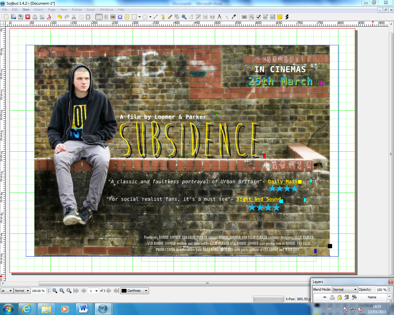
This is the final stage of our poster, and the final copy. Layer 7 was adding the certificate '15' in the bottom left corner. After moving the certificate around, we decided that it was the best place, and its what helped the layout of the poster the most. With this being the final copy, we were happy with the design, layout and image. The colour scheme was yellow, blue and white. The brick wall helped emphasise a social realist location (wall with graffiti on) and the very layed back, isolated look. The final copy was made through both Pixlr and Scribus.
Reseacrh and Planning: Casting for 'Lizzie'

Lara Gavin played the role of Lizzie in 'Subsidence' as she fitted the character description fairly well, and only had to make slight adaptations to her normal self in order to play Lizzie's role in the film. Lara is currently completing her A-Level drama studies, so acting was no challenge for her, it was just experience. She is also very friendly with Dom (our male actor) so there is a friendly chemistry between them and this helped when on camera, as they felt comfortable in eachothers presence.
Monday, 25 March 2013
Reseacrh and Planning: Casting for 'Ty'
We needed a hard-looking, strong young 'lad' to play the part of 'Ty'. This character is very manipulative and mischevious. He is known for being a trouble-maker with low aspirations to succeed in the future. He has anti-establishment values and morals which gains him status and respect when it comes to his peers.
.JPG) We decided to use Dom to play this part as he, (with some costume work) fitted the general visual description we were aiming for. He has his head shaven which enhances the 'hard' look and when acting, he performs the role with the correct mannerisms and attitudes. Dom also has a very michevious character, and although its a different way to Tyrone, it could easily be adapted and changed to fit the character profile.
We decided to use Dom to play this part as he, (with some costume work) fitted the general visual description we were aiming for. He has his head shaven which enhances the 'hard' look and when acting, he performs the role with the correct mannerisms and attitudes. Dom also has a very michevious character, and although its a different way to Tyrone, it could easily be adapted and changed to fit the character profile.
.JPG)
Thursday, 14 March 2013
Reseacrh and Planning: Locations
Here are some locations which we are considering for our film trailer. We have taken the conventions of 'Urban Britain' and have tried to represent this through the location and settings of our shots. Theres areas often suffer from poverty and lack of maintenance and differ greatly from more middle class areas. For some of our shots we want to show the contrast between the two backgrounds of the characters. 'Lizzie' is from a more middle class family so through the mise-en0scene, we wish to portray this representation.


These garage areas also represents the working class locations which we are focussing on. This concept is widely associated with lower classes due to the compact housing areas which leave little room for gardens/driveways. Middle/upper class houses often include a private garage with strong security. This location subtly emphasises this.


This photograph shows metal fencing and blocks of flats behind. We are able to understand the nature of the trailer through the mise-en-scene and this particular location reinforces the poor living conditions and restrictions these people face within their lives.

We are going to include more locations of a similar nature using the same ideas behind them. Our plan is to reinforce the class boundries and emphasise the living conditions of the lower classes.
Saturday, 2 March 2013
Research and Planning: Website Hompage - 'Angels' Share'

 There is a page which provides audiences with the logos of the institutions which worked on this film. We want to base our ideas on a similar concept but include more background information on them to attempt to provide a foundation for perspective audiences.
This is important because they can understand certain aspects of the film and see how the institution corresponds with the film itself. This is also a way in which we can develop norms and conventions of existing products.
What also stood out for us within this website, was the use of vivid colours. For a gritty, social realist genre of film, it seems ironic to use bolder colours which ultimately represent happier connotations. We want to ultimately expand on the idea of using bright colours within our products so that similar delusions can be made. Life is not always straight forward and the harsh realities of this may come as a surprise during the film. This is exactly what entices an audience. The 'shock factor' produces strong effects on the audience and ultimately reinforces the gritty tone to the film as a whole.
Friday, 1 March 2013
Shifty- Research and Planning of existing products.
It's important when making a trailer, to watch other trailers that have chosen the same genre as you, both recent and old, that can help you to identify the key conventions of the genre and help us to learn more in general about social realism.
We looked at a few trailers, including 'Fish Tank' and 'Shifty', that both are classed as a social realist films that each portray their own views on Urban Britain. In this particular blog, we will focus on Shifty. Shifty is an Urban Britain thriller, produced and written by Eran Creevey, and released on the 29th April, 2009. It follows the life of a young London drug dealer who sells drugs in the estate where he lives, competing with rivals. His old buddy turns up Chris, who has moved away from their childhood to own a house with a mortgage, a good job and a family on the way or in his mind.
Moving away from the plot, this trailer consists of short and quick clips that jump to places randomly to help tell the story and sell their idea. With this fast pace, follows a very clever technique intentionally used by Creevey in the making of the trailer, this technique is using the pace to reflect the atmosphere and the drug effect. This is one thing we wanted to do, and used this research to contribute to our film. As our film is also about the drug life, and how it can affect a life, we closely analysed this trailer as it was a success, and we intended to use this as a guideline in how to make a successful social realist film, based around the ideas of drugs. This pace was created through the editing style, and how the jump allows the story to be told quicker, and although we didn't use this technique, we did use the idea of quick pace to show how drugs jumbles the mind into confusion and everything around you becomes out of time, and it was important for us for the audience to interpret this particular feeling the drugs can give a human. This followed the intention we had to negatively portray drugs, as no-one would like to have a confused mind where everything seems surreal or out of the norm.
Shifty didn't use graphics like us, yet it told the story in a different way. This was one we considered, but didn't have the skill to execute. This was the 'jump' to different stages of the film and the trailer basically informed the audience of most of the locations featured in the film.
Another similar technique we used along with Shifty, was the specific focus on the main characters, and how they featured in every clip. This focus in a technique we chose to follow as we knew it was important in the identification of the costume and character, which from the feedback we gained was important in relating to the genre.
We also completed a poster analysis of the Shifty poster, and researched into why they chose the colours they did, and how important this is to a film poster in the social realist genre. The poster is dominantly yellow and black in terms of background, and colour scheme that we also followed, not copied. We though the colour scheme worked well, and suited the background we chose, and shifty had great poster reviews, so we opted to follow the colour scheme of a bright text colour, yet a gloomy background of the wall, tattered and old. Shifty is mainly bright, which was technique we did not want due to the idea we wanted to remain that sense of negativity behind drugs, and emphasise also that his film isn't one with a happy outcome. In terms of the layout, we took our own instinct and judged it for yourself, trying out different positions and finalising with the one we kept. The use of the two main actors on the front is something we considered, but did nor chose to follow for two reasons, to similar to Shifty and we felt that our actor Dom (ty) looked better alone on the wall, and suite the wall more than Lara did, helping the audience identify an idea of social realism from the image.

Research and Planning: Existing Products - 'Fish Tank'
In order for us to fully understand and produce a realistic representation of a social realist genre and film, we have looked at existing social realist film trailers, posters and websites. This has enabled us to use and develop the codes and conventions of these existing products within our own work.
For example, 'Fish Tank' is a social realist film directed by Andrea Arnold. We watched the film from start to finish, and then looked at the trailer afterwards. We thought that by doing it this way, we could understand why and how the trailer was constructed the way it was. This allowed us to witness which aspects of the film were included in the trailer and what effect was created from this. We found that aspects of the most dramatic and intense clips, out of the entire film, were deliberately included within the trailer. This ultimately created suspense and captures attention straight away. This then allows audiences to be curious and intrigued as to what series of events has led to this. The mise-en-scene included within the film and the trailer also presents the genre straight away, it is very clear and allows no room for misunderstanding. The use of editing and mise-en-scene have the ability to connect the film to its audience. This is done within the trailer to attract the correct audience to see the film. This is done effectively by being able to relate to the audience through characters, costume, locations, relationships etc. aswell as the fast cuts bewtween shots and the suspense this builds. This forms a connection between the institution and the audience which can ultimately promote upcoming and future films from the same institutions. We wish to offer a similar representation of the genre aswell as our film as a whole within our film trailer.

 We also looked at the advertising and promotion products which were created for 'Fish Tank'. The poster which is presented above, provided us with a basis and guideline for our Ancillary Products. What instantly stood out for us, was the colour scheme of the text along with the illusion that this was within the mise-en-scene instead of being super-imposed onto the image seperately. This automatically connects the two aspects together and allows the product to emphasise the realism of the overall tone. In other words, it does not follow the same conventions of blockbuster Hollywood movies, where the glossy film posters tend to provide information about the films by putting text on top of an image rather than in the image. ('The Dark Night' film poster on right is example of this). This provides the audience with the idea that our world and the world of the film are the same, reinforcing the gritty realism. This is also done by anchoring the colour scheme of the text with the colours within the scene of the image. The colours seem to represent immaturity (Baby pink and Baby blue). However, the wall that the text is presented on seems old and worn away. There are stains and rips in the wallpaper which emphasise the idea that 'Mia' (the main character who is presented within this poster) is growing up and getting too old for her old life.This is reinforced through the way the character is looking away from the scene, out of (what appears to be) a window. We assume that it is a window through the use of lighting on her face and this interpretation is reinforced through her body language and facial expression. It would seem that she is looking unhappy with her current situation and is ambitious in terms of changing her lifestyle. Again, we feel that strong links are made between the film and it's audiences. This is done through the overall presentation as many young people may be able to realte to this. We feel that 'Mia' is presented in a way which allows people of a similar age, class or situation to be able to realte to her which makes the film much more personal. By doing this, the institution has therefore made strong links with their audiences whcih ultimately provides a much more personal response to be made from this.
We have gained massively from looking at existing products, the aspects which have been very appealing and unique have guided our planning and research as we feel that these specific points are successful with executing the genre as well as effective promotional and advertising products for the film.
Subscribe to:
Posts (Atom)