Mike Leigh is a very well-known social realist film director, who tackles the most serious and divise subjects and situations which occur within society. He emphasises the harsh, gritty reality of social issues. Such films include Secrets and Lies, Life is Sweet, All or Nothing etc.
Leigh uses particular techniques within his film-making so that the most realistic effect is obtained. For example, his actors often endure hours of intense improvisation before the script is finalised so that reactions and conversations are as natural as possible. He writes the script as the scenes are being nuilt up through improvisation within rehersals. The fact the actors are involved within the 'creative process' means that their performances become very natural and realistic which is what Leigh initially wanted to obtain.
Mike Leigh also ploughs enormous amounts of research into every film so that each aspect is covered. These films often are of a downbeat nature which reinforces the gritty atmousphere. They frequently focus on families, relationships, sex, work etc. Leigh claims ' Primarily, my films are a response to the way people are, to the way things are as I experience them'.
Overall Mike Leigh's techniques reinforce the realism to the genre, he structures natural scenes through actor's improvisation and allows situations and reactions to be created by this. Within our film trailer, we wish to use similar aspects so that we obtain the same results. We want our film to be as natural and as realistic as possible.
Wednesday, 27 March 2013

Primary Research- Interview
We interviewed Jack Breckall before we made the film, in order to gain more of an insight into the film genre of social realism. In the interview we asked him some questions about our ideas, to gain some feedback and use him as an example of the genreal public. Jack is 17 years old, and based on our ideas, it's this age range that will be our target audience.
Us: "Hello Jack, we are making a social realist trailer for our Media coursewok at A-Level. We have handed out the questionnaires and gained some interesting feedback. We were thinking of calling our film 'Subsidence'-what do you think?"
Jack: "I've actually never heard of this word before, but it sounds very catchy and unique. What does it mean?"
Us:" Well, to subside you lower yourself and in relation to our film, its about a young girl and how she her lowers herself through drugs, and in terms of class. This is due to her boyfriends addiction and his influence on her- therefore she subsides from her middle class to lower class and also in terms of her emotion."
Jack: "Oh, I get it now. Well thats a real clever way to use the title to represent the events in the film or trailer. It's catchy and from what I know, there isnt a film out with this name or one that has this exact storyline. "
Us: "No, you're right. This is what we carefully considered in making the trailer and devloping the plot. Moving on to the additions to the trailer, do you think a soundtrack is vital to a film of this genre, or infact, and genre?"
Jack: "Well, I actually have watched social realist films before and I really like them, Shifty being a personal favourite. I really like the soundtrack to Shifty, especially in the trailer. I think the soundtrack is crucially important in the making of a trailer, and it added to the appeal of the film in general, well, in my own personal opinion. So, the answer to your question would be a concrete Yes!! And that applies to all films really."
Us: "Yes, we have researched into Shify and other social realist films, and we found the soundtrack to really help create an atmosphere. What genre of music would you associate with the soundtrack though?"
Jack: "I would avoid pop and classical, and focus on Drum and Bass. If it has a beat, it helps the pace of the trailer flow and this helps keeps the audiences attention. Does that help?"
Us: "Yes, very much. We actually agree with you 100% in the way you talk about the pace having to flow. One last question, what sort of areas/locations would you associate with a social realist film/trailer?"
Jack: "Well, I noticed in Shifty there was a lot of flats and subways etc. These are common areas that seem to be associated with the working class, and that would apply to your film. Also, old warehouses, drug dens and working class estates. Of course, there is the idea of graffiti walls you have to consider."
Us: "Yes, thanks for your time Jack. This has been very helpful in conducting our primary research. It has been very useful"
Jack: "No problem, see you around".
Us: "Hello Jack, we are making a social realist trailer for our Media coursewok at A-Level. We have handed out the questionnaires and gained some interesting feedback. We were thinking of calling our film 'Subsidence'-what do you think?"
Jack: "I've actually never heard of this word before, but it sounds very catchy and unique. What does it mean?"
Us:" Well, to subside you lower yourself and in relation to our film, its about a young girl and how she her lowers herself through drugs, and in terms of class. This is due to her boyfriends addiction and his influence on her- therefore she subsides from her middle class to lower class and also in terms of her emotion."
Jack: "Oh, I get it now. Well thats a real clever way to use the title to represent the events in the film or trailer. It's catchy and from what I know, there isnt a film out with this name or one that has this exact storyline. "
Us: "No, you're right. This is what we carefully considered in making the trailer and devloping the plot. Moving on to the additions to the trailer, do you think a soundtrack is vital to a film of this genre, or infact, and genre?"
Jack: "Well, I actually have watched social realist films before and I really like them, Shifty being a personal favourite. I really like the soundtrack to Shifty, especially in the trailer. I think the soundtrack is crucially important in the making of a trailer, and it added to the appeal of the film in general, well, in my own personal opinion. So, the answer to your question would be a concrete Yes!! And that applies to all films really."
Us: "Yes, we have researched into Shify and other social realist films, and we found the soundtrack to really help create an atmosphere. What genre of music would you associate with the soundtrack though?"
Jack: "I would avoid pop and classical, and focus on Drum and Bass. If it has a beat, it helps the pace of the trailer flow and this helps keeps the audiences attention. Does that help?"
Us: "Yes, very much. We actually agree with you 100% in the way you talk about the pace having to flow. One last question, what sort of areas/locations would you associate with a social realist film/trailer?"
Jack: "Well, I noticed in Shifty there was a lot of flats and subways etc. These are common areas that seem to be associated with the working class, and that would apply to your film. Also, old warehouses, drug dens and working class estates. Of course, there is the idea of graffiti walls you have to consider."
Us: "Yes, thanks for your time Jack. This has been very helpful in conducting our primary research. It has been very useful"
Jack: "No problem, see you around".
Primary Research - Questionnaire results

These pie charts present us with the results of our questionnaire. This provides us with the basis of what our film trailer needs to include in order to represent the specific genre. We received feedback on the title, the genre of soundtrack, and what the general codes and conventions are typically used within a social realist genre film. This allows us to expand these results further through interviews so that we can understand what our audience want.
We specifically asked the people who fit the target audience age range, this means that the results will hopefully reflect the ideas and perspectives of the intended audience of the film. This way, the most effective and realistic trailer can be created. In terms of age range, we handed out 10 questionnaires and gained 10 results of feedback, which was very helpful in terms of making the film. The feedback we gained was from 9 people aged in-between 15-21 which fitted in-to our target audience, and it was a predominant task to get this, we then got feedback from one elder member of the public, to gain feedback from a different angle of society. The gender was 5 males, 5 females.
In gaining this feedback we then could start making the film, and this feedback helped us to add a soundtrack, following the feedback gained about an upbeat track, which then led onto the mise en scene and how the graffiti and costume were popular signs of 'Urban Britain' which is why we added this to the poster and website. Finally, with our question on the name of the film, 'Subsidence' was very popular, being referred to as 'Unique and catchy' by one sheet of feedback.
So overall, it made a significant difference in terms of affecting our product and helping us decide what route to take and what addition, and subtraction were needed in order to make a better product, and this combined with our own ideas created a successful product in terms of the trailer, and both ancillary tasks (the poster and website).
Reseacrh and Planning: Poster Development (ANCILLARY PRODUCT)
We uploaded and edited the picture on a programme called 'Pixlr'- which is a photo editing programme. We enhanced the brightness and contrast of the photograph, and the top corner of the original photograph had houses in the background, which we didn't want as we thought it made the photo lack appearance and it looked slighty odd. We used a tool that 'Pixlr' offered that allowed us to copy the brick wall and add to the original wall which made the wall look whole. This was the Clone stamp tool located in the tool bar offered by the program.

Once we had done this, we transported the photo over to a programme called 'Scribus' which is Desktop Publishing Programme. This allows up to apply text on top of the photo, which lead to the end product of our poster. This above, is a print screen of how we started on Scribus, with just the basic image, no text. This was layer 1 of the image, and stage 1 of the process. We slightly re-sized the original image to fit the poster size, which worked to good effect, and with this the poster gained more space to add text and more room to focus on the image manipulation stages of the process.


This above, is layer 3 of the poster making process. We have added an extra layer of text, 'A film by Loomer and Parker'. This was added in the colour white, and rested on the top left corner of the title. This added to the structure of the poster, and the layout was starting to come together. The reason we chose white, was to help break the colour scheme up, and give the poster more appeal- and it also worked better than the yellow, blue and black we originally tried. We then used the effects tool that helped highlight the colours, and this was changed to highlight the white, so it helped draw the veiwers eyes to the central text, of our names and the film title.

This above, was layer 4 of the poster. Here, we have added the billings to the poster, which is a common convention of all posters. We chose the white as it linked to the previous addition of text to the poster. Also, against the dark mould of the wall, it stood out the most and added to the appeal. We positioned the billings deliberately in the bottom corner, as the red brick of the wall stopped where the text (billings) started which give the correct affect we intended to give, and complimented the posters structure.

Layer 5 (above) is the stage we added the film responses from the 'Daily Mail' and 'Sight and Sound'. We added these to help give the poster appeal, and in our research into posters, most posters used this to help attract the audience to watch the actual film. We positioned it below the wall, following our original colour scheme of blue, white and yellow. At this stage, we considered a crop, but this didn't work so we 'undo'd' this action and continued with the development.

Layer 6 of the poster, was near the final stages of the poster. We added the release date in the top right corner, this was an attempt to draw the onlookers eyes elsewhere in the poster, noticing the small areas of graffiti on the wall that help portray the film genre- social realism. Colour scheme- blue and white.


Once we had done this, we transported the photo over to a programme called 'Scribus' which is Desktop Publishing Programme. This allows up to apply text on top of the photo, which lead to the end product of our poster. This above, is a print screen of how we started on Scribus, with just the basic image, no text. This was layer 1 of the image, and stage 1 of the process. We slightly re-sized the original image to fit the poster size, which worked to good effect, and with this the poster gained more space to add text and more room to focus on the image manipulation stages of the process.

This above, is the second stage of our poster development process. This is layer 2 of the poster, and we have added the title 'Subsidence'- with the font being chosen from Dafont of the Internet. This has been positioned on the wall to help make the poster have more of a structure. The colour scheme was chosen to help reflect the atmosphere, and it also linked with the costume of 'Ty' and the colour of his shirt. The reason we chose this text was because it had a handwritten style, which helped reflect the realistic element of our genre. We thought that the use of the shadow effect creates more depth and is much more effective.

This above, is layer 3 of the poster making process. We have added an extra layer of text, 'A film by Loomer and Parker'. This was added in the colour white, and rested on the top left corner of the title. This added to the structure of the poster, and the layout was starting to come together. The reason we chose white, was to help break the colour scheme up, and give the poster more appeal- and it also worked better than the yellow, blue and black we originally tried. We then used the effects tool that helped highlight the colours, and this was changed to highlight the white, so it helped draw the veiwers eyes to the central text, of our names and the film title.

This above, was layer 4 of the poster. Here, we have added the billings to the poster, which is a common convention of all posters. We chose the white as it linked to the previous addition of text to the poster. Also, against the dark mould of the wall, it stood out the most and added to the appeal. We positioned the billings deliberately in the bottom corner, as the red brick of the wall stopped where the text (billings) started which give the correct affect we intended to give, and complimented the posters structure.

Layer 5 (above) is the stage we added the film responses from the 'Daily Mail' and 'Sight and Sound'. We added these to help give the poster appeal, and in our research into posters, most posters used this to help attract the audience to watch the actual film. We positioned it below the wall, following our original colour scheme of blue, white and yellow. At this stage, we considered a crop, but this didn't work so we 'undo'd' this action and continued with the development.
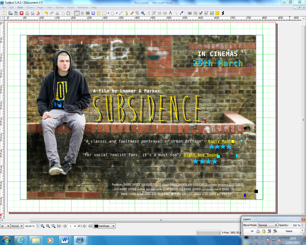
Layer 6 of the poster, was near the final stages of the poster. We added the release date in the top right corner, this was an attempt to draw the onlookers eyes elsewhere in the poster, noticing the small areas of graffiti on the wall that help portray the film genre- social realism. Colour scheme- blue and white.

This is the final stage of our poster, and the final copy. Layer 7 was adding the certificate '15' in the bottom left corner. After moving the certificate around, we decided that it was the best place, and its what helped the layout of the poster the most. With this being the final copy, we were happy with the design, layout and image. The colour scheme was yellow, blue and white. The brick wall helped emphasise a social realist location (wall with graffiti on) and the very layed back, isolated look. The final copy was made through both Pixlr and Scribus.
Reseacrh and Planning: Casting for 'Lizzie'

Lara Gavin played the role of Lizzie in 'Subsidence' as she fitted the character description fairly well, and only had to make slight adaptations to her normal self in order to play Lizzie's role in the film. Lara is currently completing her A-Level drama studies, so acting was no challenge for her, it was just experience. She is also very friendly with Dom (our male actor) so there is a friendly chemistry between them and this helped when on camera, as they felt comfortable in eachothers presence.
Monday, 25 March 2013
Reseacrh and Planning: Casting for 'Ty'
We needed a hard-looking, strong young 'lad' to play the part of 'Ty'. This character is very manipulative and mischevious. He is known for being a trouble-maker with low aspirations to succeed in the future. He has anti-establishment values and morals which gains him status and respect when it comes to his peers.
.JPG) We decided to use Dom to play this part as he, (with some costume work) fitted the general visual description we were aiming for. He has his head shaven which enhances the 'hard' look and when acting, he performs the role with the correct mannerisms and attitudes. Dom also has a very michevious character, and although its a different way to Tyrone, it could easily be adapted and changed to fit the character profile.
We decided to use Dom to play this part as he, (with some costume work) fitted the general visual description we were aiming for. He has his head shaven which enhances the 'hard' look and when acting, he performs the role with the correct mannerisms and attitudes. Dom also has a very michevious character, and although its a different way to Tyrone, it could easily be adapted and changed to fit the character profile.
.JPG)
Thursday, 14 March 2013
Reseacrh and Planning: Locations
Here are some locations which we are considering for our film trailer. We have taken the conventions of 'Urban Britain' and have tried to represent this through the location and settings of our shots. Theres areas often suffer from poverty and lack of maintenance and differ greatly from more middle class areas. For some of our shots we want to show the contrast between the two backgrounds of the characters. 'Lizzie' is from a more middle class family so through the mise-en0scene, we wish to portray this representation.


These garage areas also represents the working class locations which we are focussing on. This concept is widely associated with lower classes due to the compact housing areas which leave little room for gardens/driveways. Middle/upper class houses often include a private garage with strong security. This location subtly emphasises this.


This photograph shows metal fencing and blocks of flats behind. We are able to understand the nature of the trailer through the mise-en-scene and this particular location reinforces the poor living conditions and restrictions these people face within their lives.

We are going to include more locations of a similar nature using the same ideas behind them. Our plan is to reinforce the class boundries and emphasise the living conditions of the lower classes.
Subscribe to:
Posts (Atom)