Wednesday, 27 March 2013

Reseacrh and Planning: Poster Development (ANCILLARY PRODUCT)

We uploaded and edited the picture on a programme called 'Pixlr'- which is a photo editing programme. We enhanced the brightness and contrast of the photograph, and the top corner of the original photograph had houses in the background, which we didn't want as we thought it made the photo lack appearance and it looked slighty odd. We used a tool that 'Pixlr' offered that allowed us to copy the brick wall and add to the original wall which made the wall look whole.  This was the Clone stamp tool located in the tool bar offered by the program.


Once we had done this, we transported the photo over to a programme called 'Scribus' which is Desktop Publishing Programme. This allows up to apply text on top of the photo, which lead to the end product of our poster. This above, is a print screen of how we started on Scribus, with just the basic image, no text. This was layer 1 of the image, and stage 1 of the process. We slightly re-sized the original image to fit the poster size, which worked to good effect, and with this the poster gained more space to add text and more room to focus on the image manipulation stages of the process.
 
 
This above, is the second stage of our poster development process. This is layer 2 of the poster, and we have added the title 'Subsidence'- with the font being chosen from Dafont of the Internet. This has been positioned on the wall to help make the poster have more of a structure. The colour scheme was chosen to help reflect the atmosphere, and it also linked with the costume of 'Ty' and the colour of his shirt. The reason we chose this text was because it had a handwritten style, which helped reflect the realistic element of our genre. We thought that the use of the shadow effect creates more depth and is much more effective.

This above, is layer 3 of the poster making process. We have added an extra layer of text, 'A film by Loomer and Parker'. This was added in the colour white, and rested on the top left corner of the title. This added to the structure of the poster, and the layout was starting to come together. The reason we chose white, was to help break the colour scheme up, and give the poster more appeal- and it also worked better than the yellow, blue and black we originally tried. We then used the effects tool that helped highlight the colours, and this was changed to highlight the white, so it helped draw the veiwers eyes to the central text, of our names and the film title.

This above, was layer 4 of the poster. Here, we have added the billings to the poster, which is a common convention of all posters. We chose the white as it linked to the previous addition of text to the poster. Also, against the dark mould of the wall, it stood out the most and added to the appeal. We positioned the billings deliberately in the bottom corner, as the red brick of the wall stopped where the text (billings) started which give the correct affect we intended to give, and complimented the posters structure.

Layer 5 (above) is the stage we added the film responses from the 'Daily Mail' and 'Sight and Sound'. We added these to help give the poster appeal, and in our research into posters, most posters used this to help attract the audience to watch the actual film. We positioned it below the wall, following our original colour scheme of blue, white and yellow. At this stage, we considered a crop, but this didn't work so we 'undo'd' this action and continued with the development.
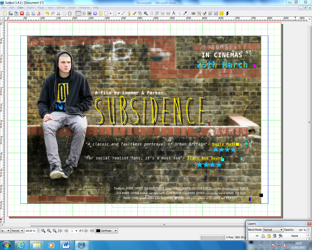
Layer 6 of the poster, was near the final stages of the poster. We added the release date in the top right corner, this was an attempt to draw the onlookers eyes elsewhere in the poster, noticing the small areas of graffiti on the wall that help portray the film genre- social realism. Colour scheme- blue and white.


This is the final stage of our poster, and the final copy. Layer 7 was adding the certificate '15' in the bottom left corner. After moving the certificate around, we decided that it was the best place, and its what helped the layout of the poster the most. With this being the final copy, we were happy with the design, layout and image. The colour scheme was yellow, blue and white. The brick wall helped emphasise a social realist location (wall with graffiti on) and the very layed back, isolated look. The final copy was made through both Pixlr and Scribus.

Reseacrh and Planning: Casting for 'Lizzie'


Lizzie was 17 years old, from London who was a lonely child, living with both her parents. She had good family support, and a stable financial background. She was tall, good looking and very lady like in terms of behaviour.


Lara Gavin played the role of Lizzie in 'Subsidence' as she fitted the character description fairly well, and only had to make slight adaptations to her normal self in order to play Lizzie's role in the film. Lara is currently completing her A-Level drama studies, so acting was no challenge for her, it was just experience. She is also very friendly with Dom (our male actor) so there is a friendly chemistry between them and this helped when on camera, as they felt comfortable in eachothers presence.  


Monday, 25 March 2013

Reseacrh and Planning: Casting for 'Ty'

We needed a hard-looking, strong young 'lad' to play the part of 'Ty'. This character is very manipulative and mischevious. He is known for being a trouble-maker with low aspirations to succeed in the future. He has anti-establishment values and morals which gains him status and respect when it comes to his peers.
We decided to use Dom to play this part as he, (with some costume work) fitted the general visual description we were aiming for. He has his head shaven which enhances the 'hard' look and when acting, he performs the role with the correct mannerisms and attitudes. Dom also has a very michevious character, and although its a different way to Tyrone, it could easily be adapted and changed to fit the character profile.

Thursday, 14 March 2013

Reseacrh and Planning: Locations

Here are some locations which we are considering for our film trailer. We have taken the conventions of 'Urban Britain' and have tried to represent this through the location and settings of our shots. Theres areas often suffer from poverty and lack of maintenance and differ greatly from more middle class areas. For some of our shots we want to show the contrast between the two backgrounds of the characters. 'Lizzie' is from a more middle class family so through the mise-en0scene, we wish to portray this representation.
This areas shows the lack of maintenance, the vandalisation and reflects the type of people live around this place. The brickwork looks old and mouldy and even the grafitti looks worn down.
These garage areas also represents the working class locations which we are focussing on. This concept is widely associated with lower classes due to the compact housing areas which leave little room for gardens/driveways. Middle/upper class houses often include a private garage with strong security. This location subtly emphasises this.
The location in the photograph above presents a block of flats, again, widely associated with the poorer society. This is because those people may not necessarily be able to afford private properties or mortgages. This type of area emphasises the 'Urban' aspect of the film and reinforces the struggles and pressures they face.
This photograph shows metal fencing and blocks of flats behind. We are able to understand the nature of the trailer through the mise-en-scene and this particular location reinforces the poor living conditions and restrictions these people face within their lives.
As we mentioned, we felt it was necessary to present more middle class locations to reinforce 'Lizzie's' background and to emphasise the contrast between the two. Here, there is electrical equiptment and kitchen appliances on show, the light from outside the window also attatches the idea that life is lighter and easier.

We are going to include more locations of a similar nature using the same ideas behind them. Our plan is to reinforce the class boundries and emphasise the living conditions of the lower classes.

Saturday, 2 March 2013

Research and Planning: Website Hompage - 'Angels' Share'

We used a Ken Loach film as research into social realist film website homepages. He is broadly known for his expertism in social realism. We used 'Angels' Share' as an example for our homepage because of the fact it is one of Loach's more recent creations therefore providing us with up to date conventions of this product. We we enjoyed the way in which the trailer was presented straight away with an image displaying the characters, as the background. (We are aware this website is presented in German, however we struggled to find the English version). The title is large and clear making it easy for audiences' attention to be instantly drawn to this. The colour used is also bold and bright influencing a lighter tone to the product.
There is a page which provides audiences with the logos of the institutions which worked on this film. We want to base our ideas on a similar concept but include more background information on them to attempt to provide a foundation for perspective audiences.
This is important because they can understand certain aspects of the film and see how the institution corresponds with the film itself. This is also a way in which we can develop norms and conventions of existing products.


What also stood out for us within this website, was the use of vivid colours. For a gritty, social realist genre of film, it seems ironic to use bolder colours which ultimately represent happier connotations. We want to ultimately expand on the idea of using bright colours within our products so that similar delusions can be made. Life is not always straight forward and the harsh realities of this may come as a surprise during the film. This is exactly what entices an audience. The 'shock factor' produces strong effects on the audience and ultimately reinforces the gritty tone to the film as a whole.

Friday, 1 March 2013

Shifty- Research and Planning of existing products.

It's important when making a trailer, to watch other trailers that have chosen the same genre as you, both recent and old, that can help you to identify the key conventions of the genre and help us to learn more in general about social realism.

We looked at a few trailers, including 'Fish Tank' and 'Shifty', that both are classed as a social realist films that each portray their own views on Urban Britain. In this particular blog, we will focus on Shifty. Shifty is an Urban Britain thriller, produced and written by Eran Creevey, and released on the 29th April, 2009. It follows the life of a young London drug dealer who sells drugs in the estate where he lives, competing with rivals. His old buddy turns up Chris, who has moved away from their childhood to own a house with a mortgage, a good job and a family on the way or in his mind.

Moving away from the plot, this trailer consists of short and quick clips that jump to places randomly to help tell the story and sell their idea. With this fast pace, follows a very clever technique intentionally used by Creevey in the making of the trailer, this technique is using the pace to reflect the atmosphere and the drug effect. This is one thing we wanted to do, and used this research to contribute to our film. As our film is also about the drug life, and how it can affect a life, we closely analysed this trailer as it was a success, and we intended to use this as a guideline in how to make a successful social realist film, based around the ideas of drugs. This pace was created through the editing style, and how the jump allows the story to be told quicker, and although we didn't use this technique, we did use the idea of quick pace to show how drugs jumbles the mind into confusion and everything around you becomes out of time, and it was important for us for the audience to interpret this particular feeling the drugs can give a human. This followed the intention we had to negatively portray drugs, as no-one would like to have a confused mind where everything seems surreal or out of the norm.

Shifty didn't use graphics like us, yet it told the story in a different way. This was one we considered, but didn't have the skill to execute. This was the 'jump' to different stages of the film and the trailer basically informed the audience of most of the locations featured in the film.

Another similar technique we used along with Shifty, was the specific focus on the main characters, and how they featured in every clip. This focus in a technique we chose to follow as we knew it was important in the identification of the costume and character, which from the feedback we gained was important in relating to the genre.


We also completed a poster analysis of the Shifty poster, and researched into why they chose the colours they did, and how important this is to a film poster in the social realist genre. The poster is dominantly yellow and black in terms of background, and colour scheme that we also followed, not copied. We though the colour scheme worked well, and suited the background we chose, and shifty had great poster reviews, so we opted to follow the colour scheme of a bright text colour, yet a gloomy background of the wall, tattered and old. Shifty is mainly bright, which was technique we did not want due to the idea we wanted to remain that sense of negativity behind drugs, and emphasise also that his film isn't one with a happy outcome. In terms of the layout, we took our own instinct and judged it for yourself, trying out different positions and finalising with the one we kept. The use of the two main actors on the front is something we considered, but did nor chose to follow for two reasons, to similar to Shifty and we felt that our actor Dom (ty) looked better alone on the wall, and suite the wall more than Lara did, helping the audience identify an idea of social realism from the image.


Research and Planning: Existing Products - 'Fish Tank'

In order for us to fully understand and produce a realistic representation of a social realist genre and film, we have looked at existing social realist film trailers, posters and websites. This has enabled us to use and develop the codes and conventions of these existing products within our own work.

For example, 'Fish Tank' is a social realist film directed by Andrea Arnold. We watched the film from start to finish, and then looked at the trailer afterwards. We thought that by doing it this way, we could understand why and how the trailer was constructed the way it was. This allowed us to witness which aspects of the film were included in the trailer and what effect was created from this. We found that aspects of the most dramatic and intense clips, out of the entire film, were deliberately included within the trailer. This ultimately created suspense and captures attention straight away. This then allows audiences to be curious and intrigued as to what series of events has led to this. The mise-en-scene included within the film and the trailer also presents the genre straight away, it is very clear and allows no room for misunderstanding. The use of editing and mise-en-scene have the ability to connect the film to its audience. This is done within the trailer to attract the correct audience to see the film. This is done effectively by being able to relate to the audience through characters, costume, locations, relationships etc. aswell as the fast cuts bewtween shots and the suspense this builds. This forms a connection between the institution and the audience which can ultimately promote upcoming and future films from the same institutions. We wish to offer a similar representation of the genre aswell as our film as a whole within our film trailer.


We also looked at the advertising and promotion products which were created for 'Fish Tank'. The poster which is presented above, provided us with a basis and guideline for our Ancillary Products. What instantly stood out for us, was the colour scheme of the text along with the illusion that this was within the mise-en-scene instead of being super-imposed onto the image seperately. This automatically connects the two aspects together and allows the product to emphasise the realism of the overall tone. In other words, it does not follow the same conventions of blockbuster Hollywood movies, where the glossy film posters tend to provide information about the films by putting text on top of an image rather than in the image. ('The Dark Night' film poster on right is example of this). This provides the audience with the idea that our world and the world of the film are the same, reinforcing the gritty realism. This is also done by anchoring the colour scheme of the text with the colours within the scene of the image. The colours seem to represent immaturity (Baby pink and Baby blue). However, the wall that the text is presented on seems old and worn away. There are stains and rips in the wallpaper which emphasise the idea that 'Mia' (the main character who is presented within this poster) is growing up and getting too old for her old life.This is reinforced through the way the character is looking away from the scene, out of (what appears to be) a window. We assume that it is a window through the use of lighting on her face and this interpretation is reinforced through her body language and facial expression. It would seem that she is looking unhappy with her current situation and is ambitious in terms of changing her lifestyle. Again, we feel that strong links are made between the film and it's audiences. This is done through the overall presentation as many young people may be able to realte to this. We feel that 'Mia' is presented in a way which allows people of a similar age, class or situation to be able to realte to her which makes the film much more personal. By doing this, the institution has therefore made strong links with their audiences whcih ultimately provides a much more personal response to be made from this.

We have gained massively from looking at existing products, the aspects which have been very appealing and unique have guided our planning and research as we feel that these specific points are successful with executing the genre as well as effective promotional and advertising products for the film.